
Web
React
Builds interactive screens in the browser, such as dashboards, admin panels and portals, that respond instantly as your team works.
Used for
- Web apps
- Admin panels
- Dashboards
- Customer portals
Product design
Research-backed product design, testable prototypes and design systems engineers can build from without guesswork.
At a glance
What it is
Product design for web and mobile apps: research, user flows, wireframes, prototypes and design systems that engineers can build from.
Flutter and the related logo are trademarks of Google LLC. We are not endorsed by or affiliated with Google LLC.
How to start
Tell us what you need in your own words. You talk to the developers who would build it and get a written, line-item estimate.
Get a project estimateA polished mock-up that ignores loading states, empty states, error messages and slow networks turns into compromises once development begins. We design those states from the start, and our engineers review flows before a screen is final.
Each engagement begins with the problem: who uses the product, what they need to get done and where they struggle today. We move quickly to low-fidelity flows, test them with real users where possible, and only then invest in visual design. The result is a clickable prototype and a component library that keeps colour, type and spacing consistent as the product grows.
Interviews, analytics review and competitor walkthroughs that turn assumptions into testable questions.
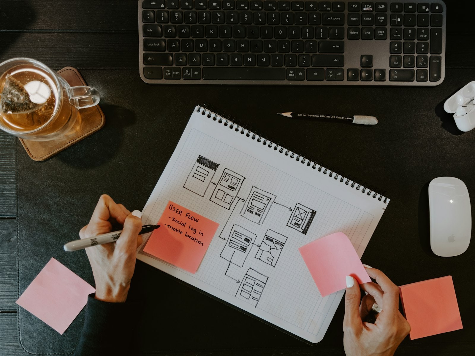
Navigation, task flows and edge cases mapped before any visual design.
Low-fidelity wireframes for quick decisions, then interactive Figma prototypes for testing and sign-off.
Typography, colour, iconography and motion for apps, web apps, admin panels and marketing sites.
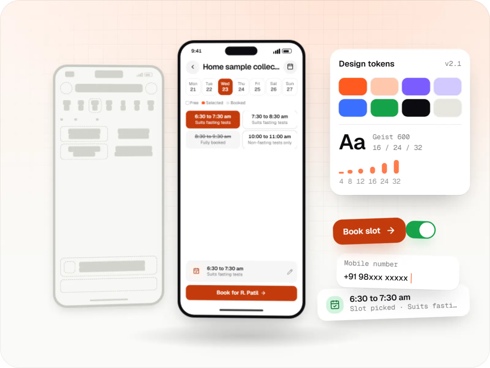
Tokens, components and usage guidelines mirrored in code, so web and mobile stay consistent.
Moderated sessions with target users, including in regional languages, with findings ranked by severity.
Heuristic and accessibility reviews of an existing product with a prioritised list of fixes.
Issues found in a prototype cost less to fix than issues found in production code.
Contrast, touch targets, focus order and screen-reader labels designed to WCAG 2.2 AA.
Screens checked with Hindi and other Indian-language strings, which often need more space than English.
Specs, tokens, component states and interaction notes in Figma, with designers available during the build.
Research notes and design rationale documented for the teams that come later.
Solutions
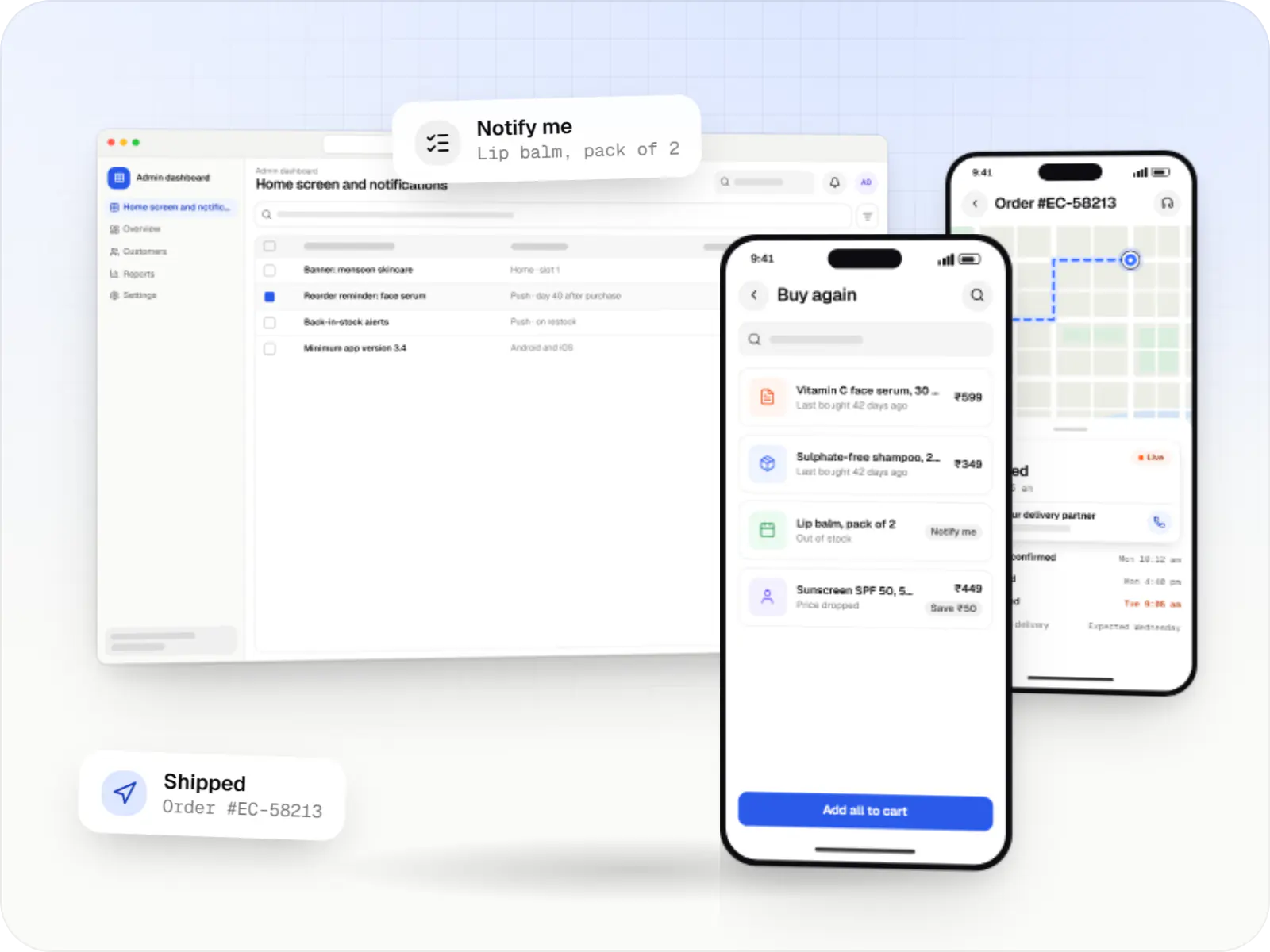
Android and iOS shopping apps with quick browsing, UPI checkout and push notifications, sharing one backend with your website.
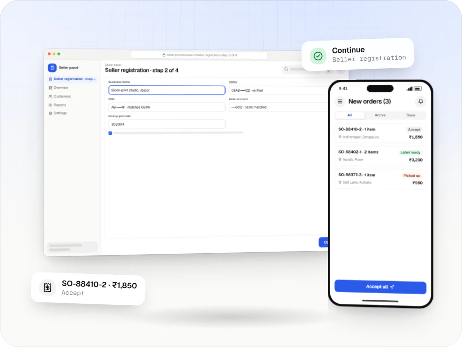
Multi-vendor marketplaces with seller onboarding, commission rules, split payouts, per-seller invoicing and catalogue moderation.
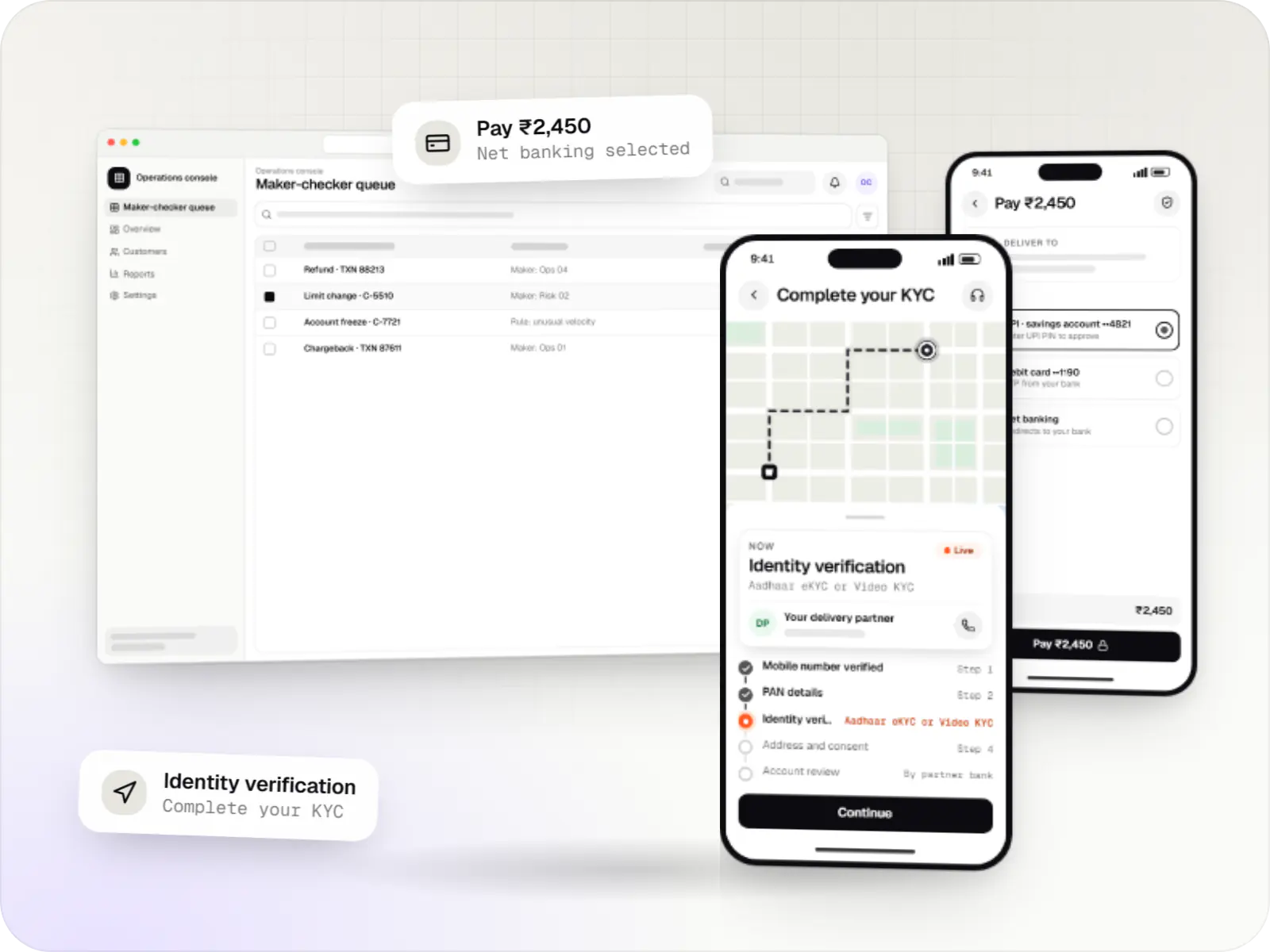
Secure fintech apps and back offices for payments, lending, investments and insurance, integrated with licensed banking, KYC and data partners.
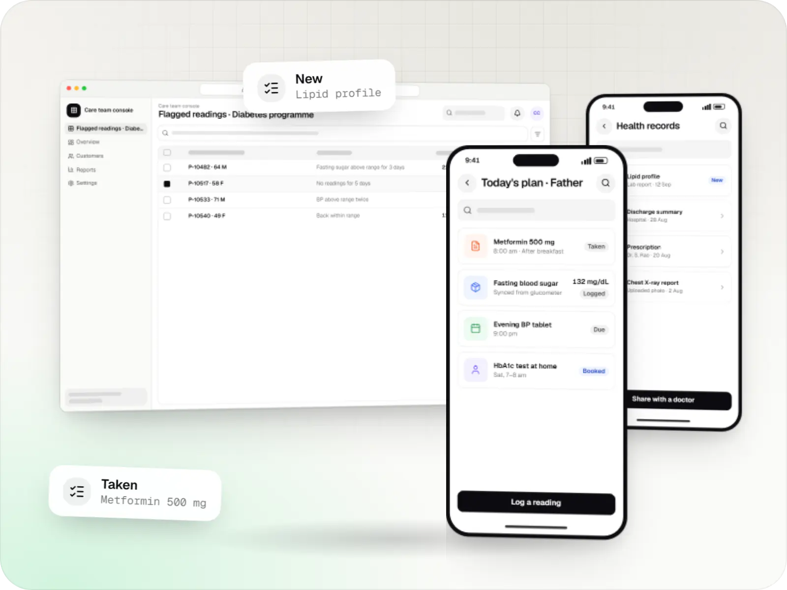
Patient and care-team apps for health records, chronic care programmes, lab bookings, wellness and follow-ups, designed with consent and privacy first.
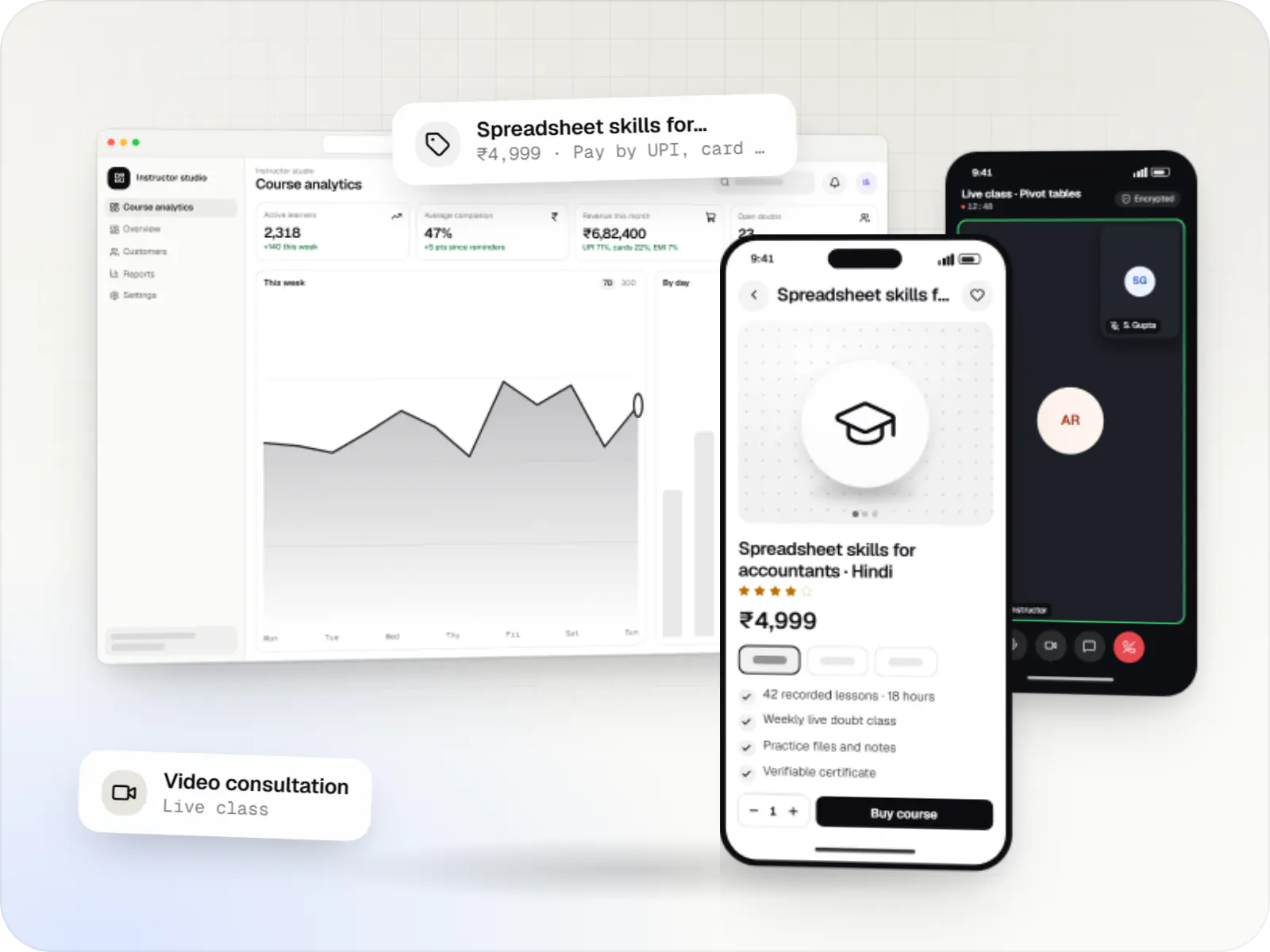
Course platforms with protected video, live classes, assessments, certificates and payments, designed for multilingual content and learners on low bandwidth.
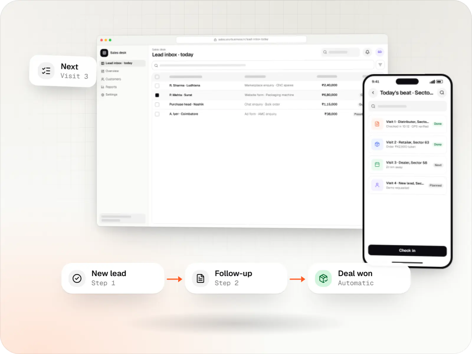
Custom CRM software that captures leads from every channel, keeps follow-ups on schedule and shows managers a live pipeline.
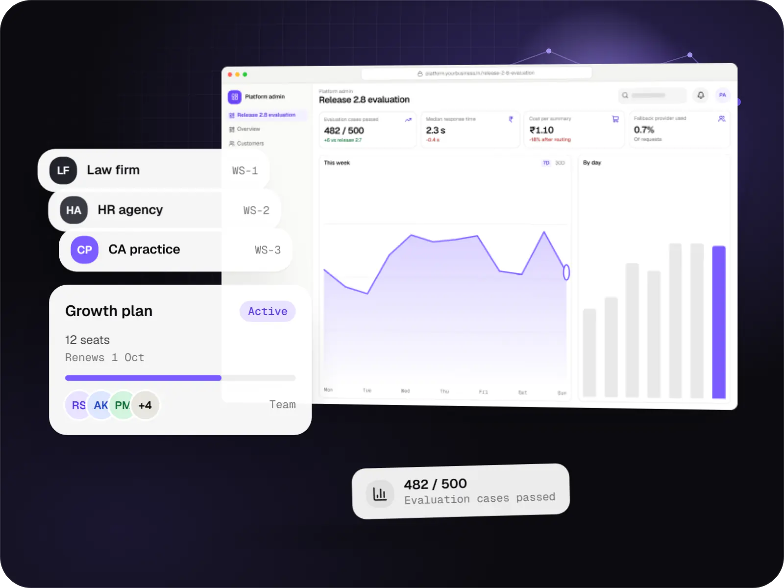
Multi-tenant SaaS products with AI at their core, built with tenant isolation, usage metering, model routing, evaluation and subscription billing.
How it works
Each step catches a different kind of problem while it is still cheap to fix, long before code is written.
We talk to the people who will use the product, review analytics and competitors, and write down what they need and where they get stuck today.
Plain black-and-white screens show the order of steps and what goes on each screen, so the structure is agreed while changes are still quick.
Realistic screens in Figma that you can tap through on a phone, so the product can be tried before anything is built.
A small group of target users try key tasks while we watch; confusing steps are redesigned and tested again.
Final screens, components, spacing, colours and every state, including loading, empty and error, are documented so developers build exactly what was tested.
Designers review the real app on phones and desktops and flag anything that drifted from the design before release.
Platforms
Websites, web apps, installable web apps, apps for Android and iPhone, and admin dashboards, each with its own layout conventions.
Marketing and content websites: fast, search-friendly pages with a CMS your team can update without a developer.
Browser-based applications with logins, roles and workflows, such as customer portals, SaaS products and internal tools.
Installable web apps with offline support and notifications, useful when an app-store listing isn't essential or phones have little storage.
Apps for Android phones and tablets, tested on budget and mid-range devices and published on Google Play or privately.
Apps for iPhone and iPad, built to Apple's guidelines and released through TestFlight and the App Store.
Back-office panels for operations, support and finance teams: orders, users, content, reports and permissions.
Technology
We design with React, Next.js, Flutter and React Native in mind, so every component in Figma has a practical, matching version in code.
Web
Builds interactive screens in the browser, such as dashboards, admin panels and portals, that respond instantly as your team works.
Used for
Web
A modern web technology for fast, search-friendly websites, online stores and web applications that load quickly on mobile.
Used for
Mobile
Build Android and iOS apps from one shared codebase, so you launch on both platforms faster with a consistent experience.
Used for
Mobile
Build Android and iOS apps in the same language as a React website, so one team can share code and skills across web and mobile.
Used for
Flutter and the related logo are trademarks of Google LLC. We are not endorsed by or affiliated with Google LLC.
Plain-English glossary
Product preview
Illustrative screens from a diagnostic lab’s home test booking journey, from first launch to confirmation, plus the developer handoff.
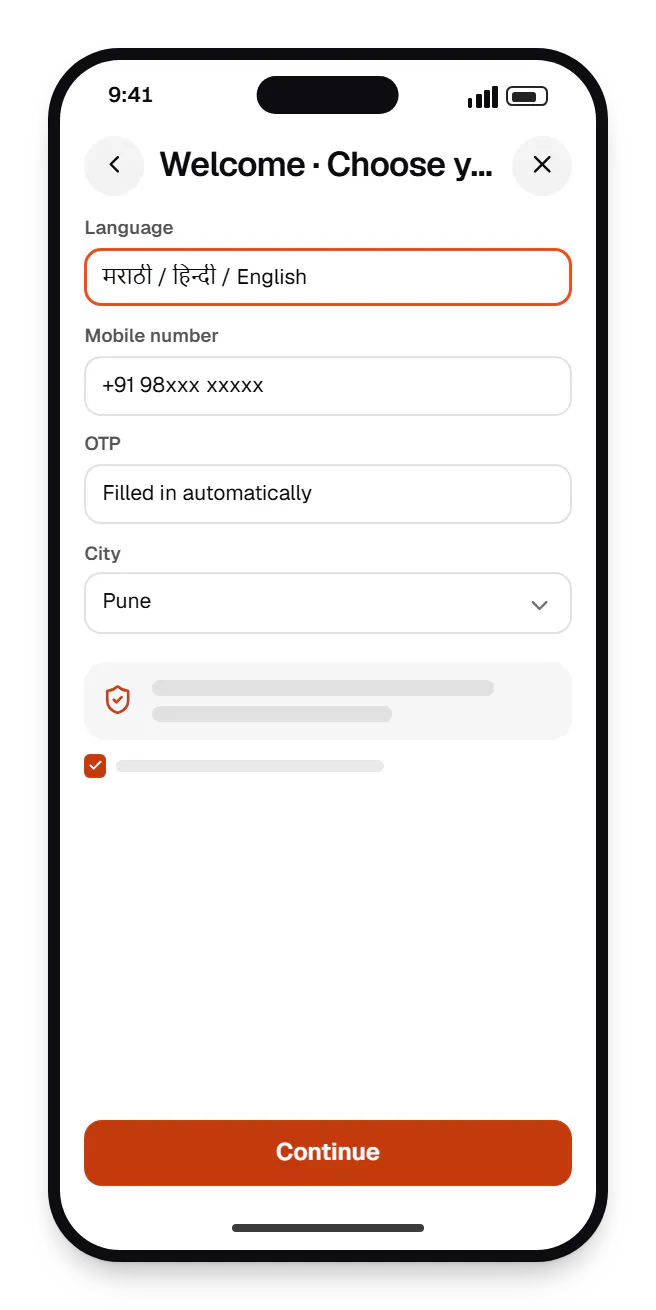
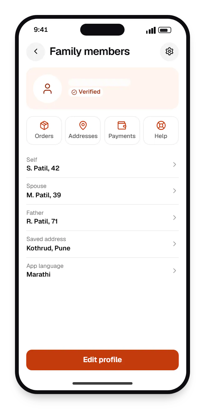
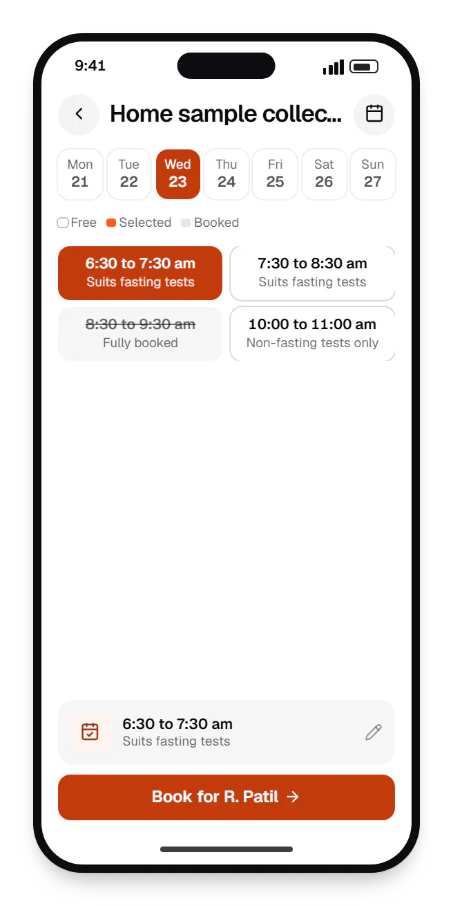
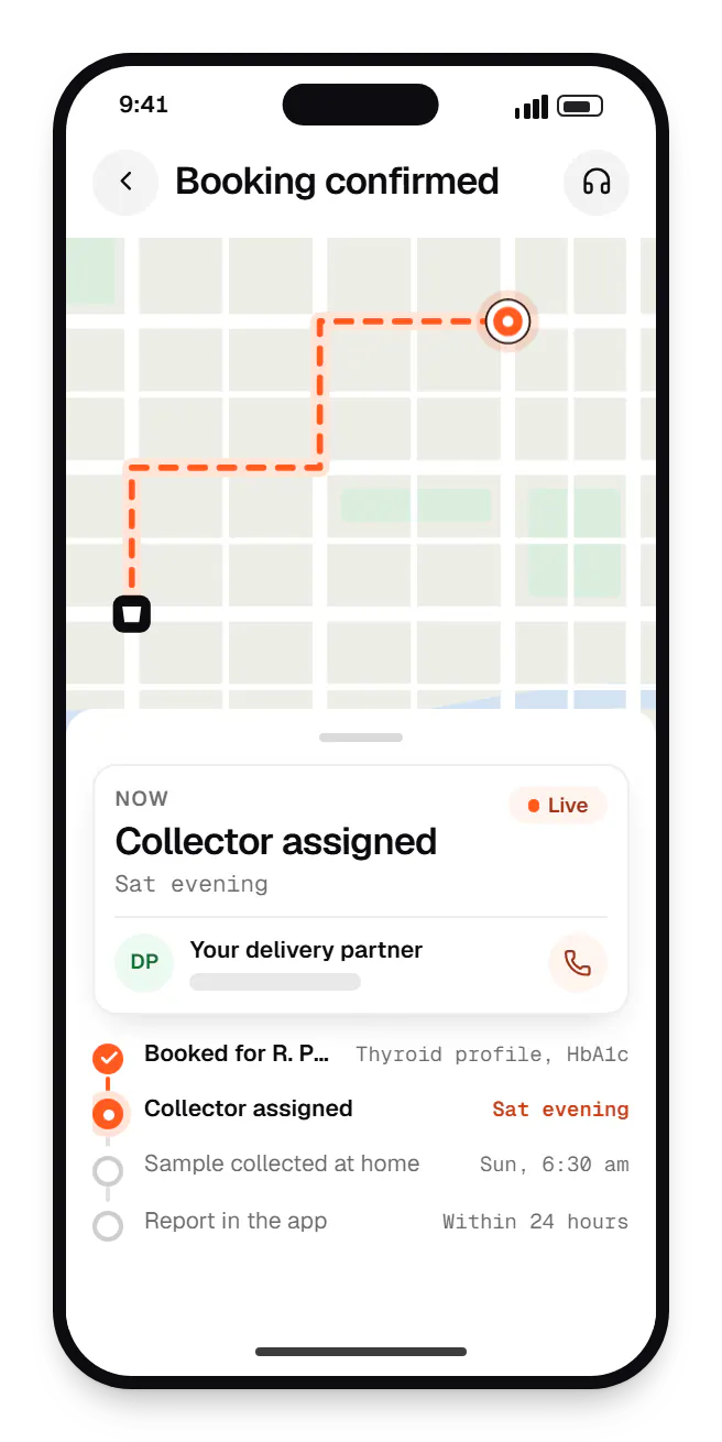
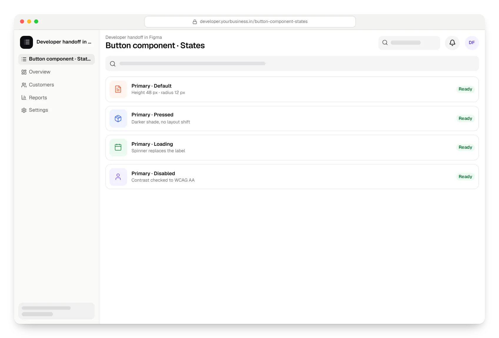
Sample screens: names, prices and figures are examples, not client data.
Work
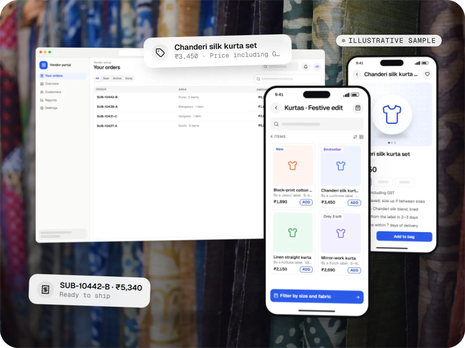
E-commerce & marketplaces
An illustrative marketplace where independent fashion labels sell through one storefront, with vendor onboarding, commission rules, multi-pickup shipping, returns and scheduled payouts.
Runs on
Built with
Healthcare software
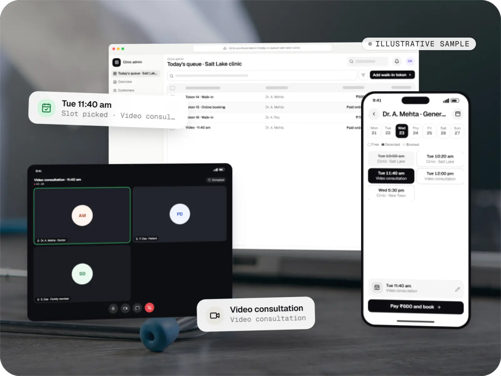
An illustrative patient app, doctor app and clinic admin for in-person and video consultations, with digital prescriptions and consent-based record access.
Runs on
Built with
Business software
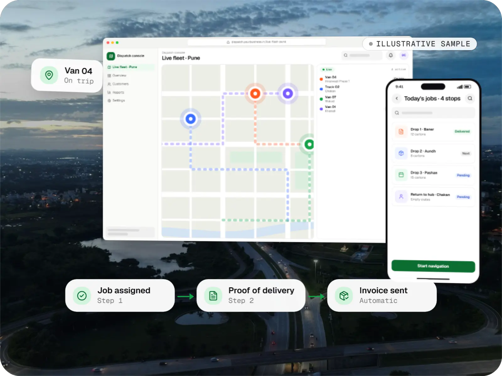
An illustrative SaaS for businesses running their own vehicles: live dispatch on a map, driver proof of delivery and per-trip billing for each customer.
Runs on
Built with
Industries
Cost drivers
Each role, whether customer, vendor, staff or admin, brings its own flows and screens.
Recruiting and interviewing users across cities or languages takes longer than stakeholder workshops alone.
Designing for Android, iOS, tablet and desktop multiplies the screen count.
A documented component library is a larger upfront piece of work that speeds up later features.
Each additional language and script needs layout checks and sometimes different font choices.
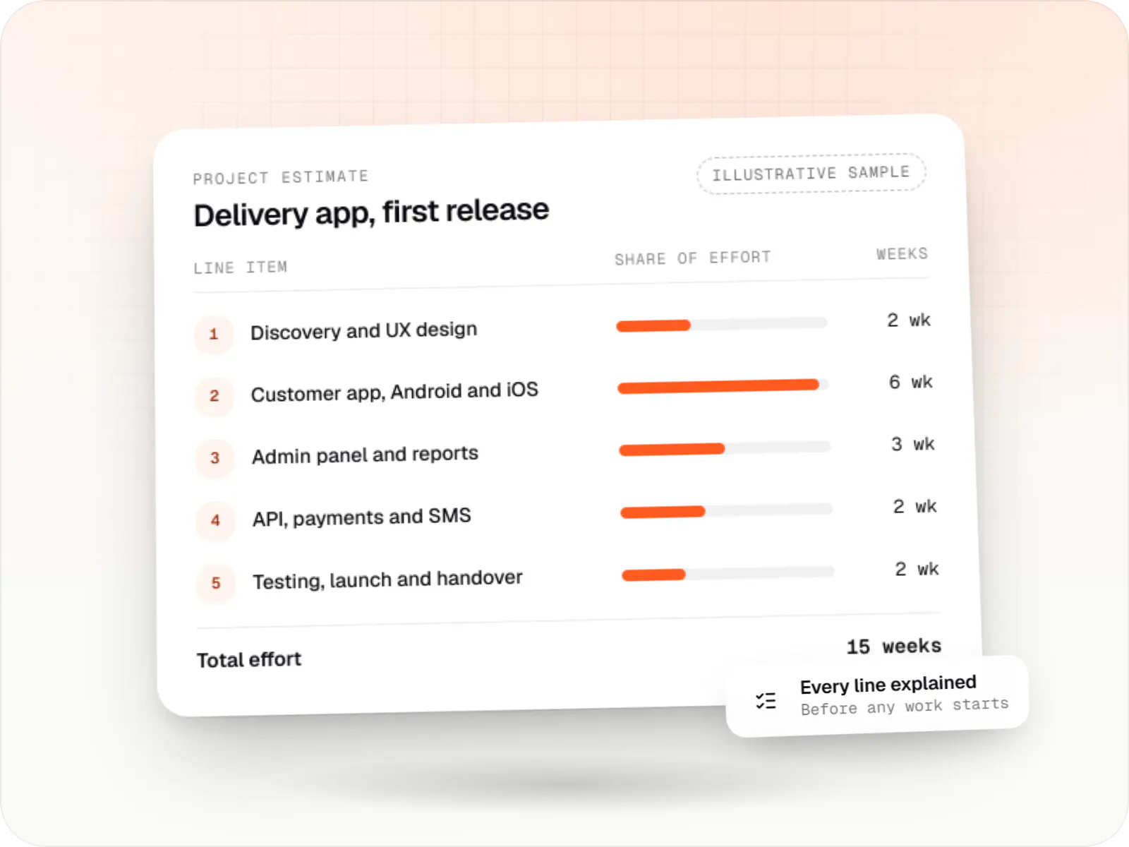
Estimates are written from your scope, with the effort and assumptions behind each line item.
How pricing worksProcess
Interviews, analytics and a review of your product or competitors to define users, goals and constraints.
You getResearch summary
User journeys and low-fidelity screens for every key task, including errors and empty states.
You getWireframe set
A clickable prototype tested with a small group of target users in each round, then revised.
You getUsability findings
High-fidelity screens for mobile and desktop breakpoints, with light and dark themes where needed.
You getFinal UI screens
Tokens and components built in Figma and matched in code by our front-end engineers.
You getComponent library
Designers review builds on real devices and log visual and interaction issues before release.
You getDesign QA report
FAQ
Usually, yes. We start with a UX audit and analytics review to find the screens causing the most drop-offs or support tickets, then redesign those first. If the codebase is reasonably structured, new designs can be rolled out screen by screen, often behind feature flags. A shared design system introduced early keeps new and old screens from looking mismatched during the transition.
Yes to both. We work in Figma, ideally inside your organisation's Figma account so files, libraries and version history stay with you from day one. At handoff you receive the design files, component library, prototypes and any research notes. Fonts, icons and photos are chosen with licences that cover commercial use, and we list them so there are no surprises later.
We keep flows short, use plain words in the user's language, show prices and delivery charges early, and prefer familiar patterns such as OTP login and UPI. Icons carry text labels, touch targets are generous, and screens are tested on entry-level phones. Where possible we run usability sessions with target users in their own language rather than relying on assumptions made in a metro office.
Yes. Design-only engagements include developer-ready handoff: annotated screens, component specs, design tokens, interaction notes and edge states. We can join your team's sprint reviews during the build to answer questions and run design QA on staging. If your developers work in React, Flutter or React Native, we can also supply coded components that match the Figma library.
Next step
Share your product brief or current app. We will propose a design scope, from a quick UX audit to a full prototype and design system.